


Designing a new website takes a lot of thought. You need to consider the pages you want on the site first up, you need to consider what type of content you’re going to publish and the main purpose of the site. Then there’s brand logos, website design and so much more.
Often a bit of an oversight is the font on your website. Yet, it plays such an integral part of keeping people reading.
Fonts bring together elements such as colour scheme and branding and paying attention to what font you use is an absolute must. Many experts in website design and companies who dedicate their business to it have offered tips down the years on this. Website builder, Duda has a really useful blog on the topic, offering up some of the best fonts to add to your website.
But what are the things you really need to consider when choosing a font?
Kick-Off With The Basics
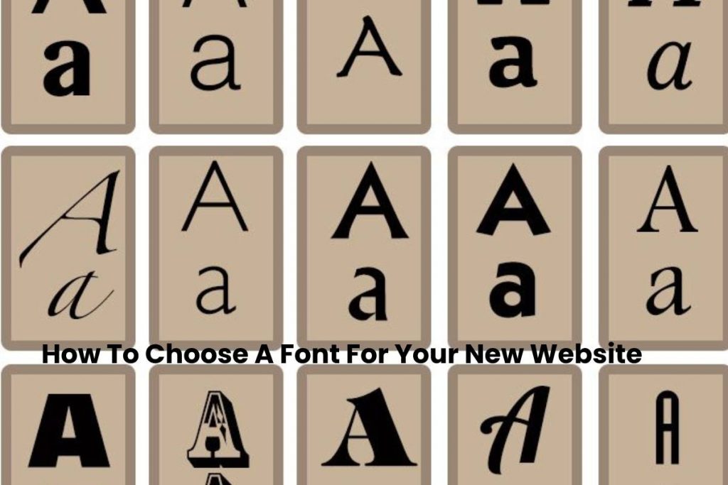
Firstly, you should start with the basics. It’s where all success begins. And at this point you need to ask yourself whether you want to go with sans or serif.
Most fonts that you’ll be using on a website fall into one of these two categories. Serif type fonts are based on the Roman alphabet and have particular strokes at the end of letters, for example Times New Roman or Georgia.
Sans on the other hand have much cleaner strokes and you’ll find fonts like Helvetica, Arial and Roboto are particularly popular when it comes to this style. Think about the audience and the vibe of your website. If your website is based on certain traditions, then you may want to go with a serif font. If your website is more high-tech and futuristic, you’re probably not going to want to choose a font that is inspired by Ancient Rome.
Think About Your Site Design
Ultimately, you are going to need a font that fits in with the design of your site. Otherwise it’s going to look very odd indeed. By answering a number of questions about your site design, you can narrow down the type of font you use. You should consider:
- What is the nature of your website? Is it a series site, or is it more relaxed and informal?
- Is your site there for the short-term or long-term? For example, if it’s being built for a project, then you can be a bit more creative. Whereas a long-term website may require different typefaces for multiple pages, email newsletters, graphics etc.
- Does your website aim to be unique or practical? Practical sites will have a much more web-friendly font than something that’s trying to upset the applecart.
- Is your site going to be text heavy or visual? Visual sites can get away with more unique and extravagant fonts as ultimately text isn’t the core element of the site.
Are You Using Multiple Fonts?
It is possible to use multiple fonts, although we’d typically stick to no more than two or three. Your primary font should be the most visible on the page and will typically be the one people most associate with your brand identity.
This will be used for headings and any stand out messages you have. Secondary fonts can then be used for your more traditional copy. This should be a much cleaner and easy to read font that will make up the bread and butter of all content on your site. For example, on a service landing page, you’d use your primary font to introduce the services and secondary to explain what they are and do.